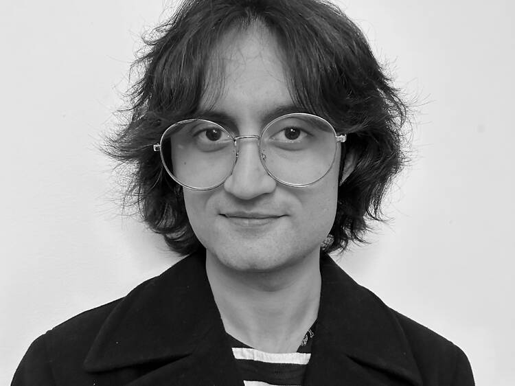
Asiimov has been writing since he could pick up a pen. After a long and angry phase of political journalism, he can now be found haunting small private views and sweaty gigs around London and writing reviews about them wherein he accidentally airs his friends' dirty laundry. He also drinks buckets of Yorkshire Biscuit Brew per diem which accounts for this whacky sleep cycle. He should probably get back to writing that novel that's been collecting dust for almost a year.
Asiimov Baker

Asiimov Baker

Contributor

Follow Asiimov Baker:

Listings and reviews (3)

Lucian Freud: Drawing into Painting

Lucian Freud: Drawing into Painting

3 out of 5 stars
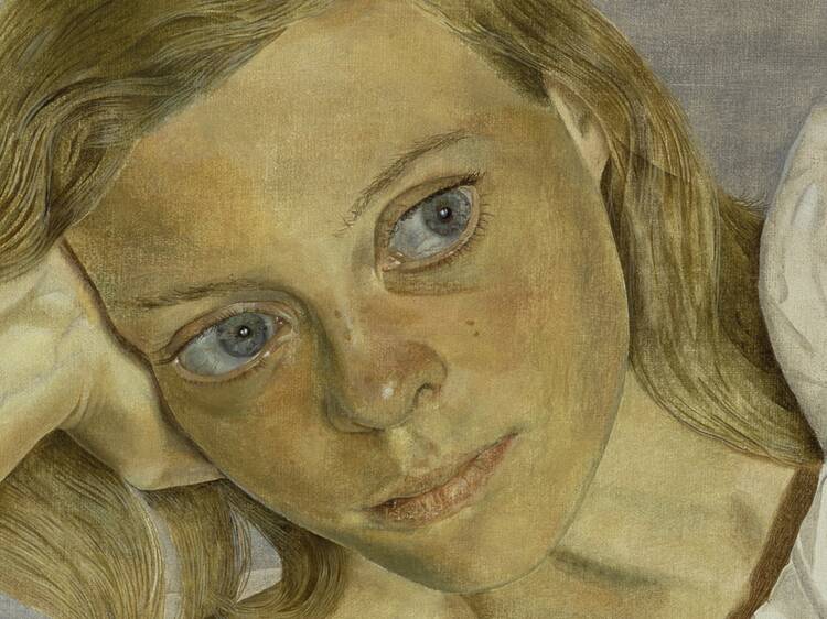
London’s art world seems convinced that it’ll implode if there isn’t a major exhibition of Lucian Freud’s works every couple of years. Following his Self Portraits show at the Royal Academy in 2019 and then New Perspectives at the National Gallery in 2022, the most recent fix comes from the National Portrait Gallery. Lucian Freud: Drawing into Painting focuses on an often-overlooked aspect of the celebrated painter’s oeuvre; his works on paper. Many artists liken drawing to thinking – you may not like everything you see when you’re allowed into their thoughts. Canvas and paper, because of their varying absorbency and materiality, require wildly different approaches. Compared to the grand monuments of Freud’s paintings, his drawings are delicate and vulnerable, which is why he largely made them as preparatory sketches or to keep a visual diary. Certain marks and motifs would be experimented with on paper before they ended up on canvas. And while he pushed the boundaries of how to represent the human form, not every experiment produced interesting results, so to base an entire exhibition around such drawings is certainly an interesting choice. Where the show really succeeds is in its curation, fostering a dialogue between Freud’s drawings and paintings. When they’re hung side by side – the figures in his drawings isolated from the painting – you really appreciate his keen observation of the body reflected in every determined line. You can see how the density of shading in prepa
Art deco: the golden age of poster design

Art deco: the golden age of poster design

3 out of 5 stars
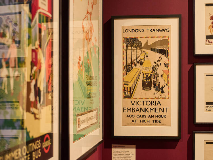
Getting on the tube these days means being bombarded with dozens of ugly advertisements, selling you everything from whisky, to electric toothbrushes and LED facemasks. However, things weren’t always this way. Unlike today’s dull Underground adverts, tube stations during the 1920s and 30s were adorned with strikingly vibrant art deco posters that promoted things to do and places to go around London. Over a hundred of these are exhibited at the London Transport Museum’s latest temporary exhibition, Art Deco: the golden age of poster design, alongside objects like a cigarette case, compact mirror, and tea set that express the decadence of that period.  Back then, a post-war economic boom had propelled consumerism, affording people more leisure time than ever.  Speed, freedom, and opportunity became the ethos of an era that could harness industrial technology in recreation rather than warfare. Such carefreeness is reflected in the bold colours, opulent typefaces, sharp geometry, and indulgent scenes of Londoners enjoying a day out. While a younger audience will be drawn to their vintage aesthetic, older visitors might find them charmingly nostalgic. Art deco didn’t get its name until the 1960s when it came under academic scrutiny; during its day it was simply known as Style Moderne. Which is fitting because many of the artists regularly commissioned by London Transport took vivid inspiration from modernist art movements such as cubism, futurism, and vorticism; unknowingly shapin
Cecil Beaton’s Fashionable World

Cecil Beaton’s Fashionable World

3 out of 5 stars
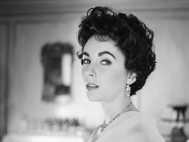
Hot on the heels of September’s merry-go-round of Fashion Weeks, the National Portrait Gallery’s latest opening is another moment to reflect on what fashion and beauty mean to us today. A second outing in five years for the trailblazing 20th century photographer, Cecil Beaton’s Fashionable World unfolds like a billowing ballgown; opulent and eye-catching, but it can’t help tripping over its long hem. The glittering charm, however, forgives its clumsiness.  Beaton’s previous outing at NPG in 2020 was cut short after only five days because of the pandemic. Rather than reviving Cecil Beaton’s Bright Young Things, this revamped exhibition presents him as more than just a photographer. Younger audiences are likely to find this show more relatable, through its emphasis on his contributions to costume and set design, given their ascendant roles in contemporary fashion. From curious beginnings to his rise through the cultural upper-class, his war photography and costume designs for My Fair Lady, we get a good look at how places and periods influenced Beaton’s style.  If anything, this show is about how big Beaton’s prop and costume chest is. Elaborately grandiose outfits screaming over intricate backgrounds made his early shots look like stills from the kind of plays Aristophanes would’ve put on during his day. Flirting with the avant-garde in Paris, Beaton’s staging and costumes turn weird and uncanny. Even during the war there’s a bold expressionism to his framing that only intensi